A desktop and mobile mockup of Terra Fortuna's website

Terra Fortuna | Mobile Responsive Landing Page

  • CODING
  • UIUX

A mobile first responsive website coded with HTML, CSS and JS.

  • Timeline

    2 Weeks

  • Languages

    HTML

    CSS

    JS

  • Tools

    Adobe Illustrator

    Visual Studio Code

The purpose: of the project was to create a responsive website design for mobile and desktop users.

Another project requirement was to implement 3 Javascript plugins for the website (Added Flickity, Accordion, and Lightbox-JS)

Planning

Before coding, there were a few requirements for this project:

  • Create a total of 5 sections

  • Implement a total of 3 Javascript plugins

  • Must be responsive for both mobile and desktop

With these requirements in mind, I had to plan out how I should lay out the website's information.

Layout

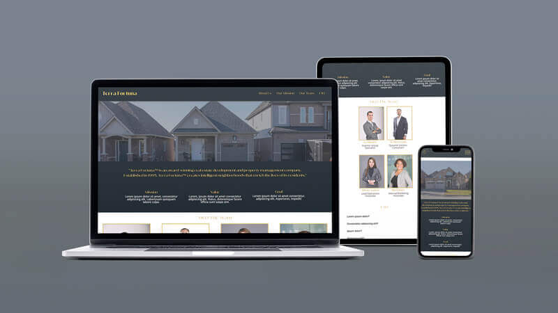
The content of the website is layed out to be easily responsive. All of the content is centre aligned because the purpose of the landing webpage is to show content quickly and in divided sections.

A sketch of Terra Fortuna's website layout

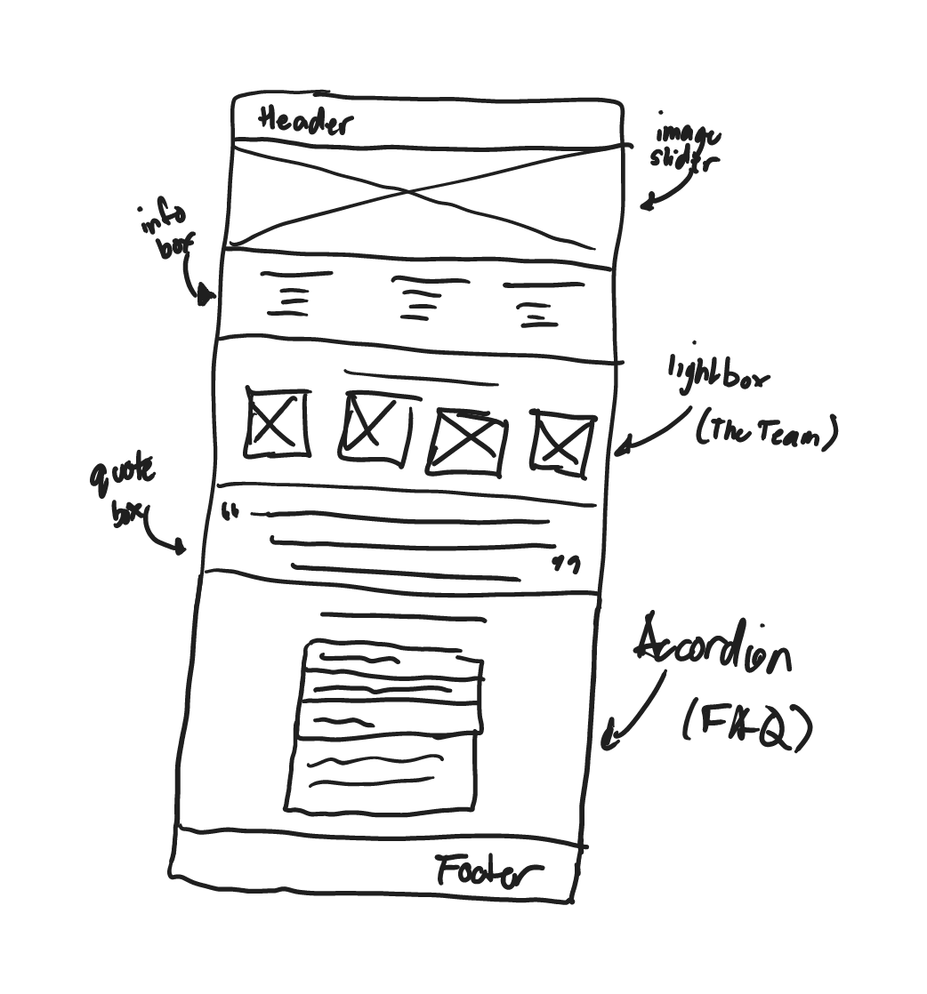
Terra Fortuna initial website layout sketch

I layed out the section in order of importance of information. I used the Javascript image slider plugin called Flickity to highlight appealing visuals for users to capture their attention. It then proceeds with the company's mission and values to reinforce the company's focus towards the users.

The team is introduced afterwards, highlighting what their position is and a brief description about them. In this section, I also implemented a Lightbox Javascript (when you click an Image, it zooms in on your screen) to let users have the option to see the image better.

Finally a FAQ Section using an Accordion Javascript plugin to easily show and hide information without crowding the UI.

Coding Process

Gallery Section

In this section, I used the Javascript plugin Flickity. I have images that highlight house properties.

Flickity image slider on Terra Fortuna's Hero Section

At higher resolution display, the image slider is replaced with a drone video that hovers over houses which is consistent with other real estate websites. Both the slider and video plays automatically so that the user's attention would be captured easily.

Video displaying at higher resolution devices

This section took the most time to code because I had to play around with the code so that the image and video fit well so that it wouldn't be squished. One issue I had was that the video wasn't responding properly at different screen resolutions where it was creating unnecessary spacing at the top. I found out that the container had a top CSS attribute that was pushing it down, which I initially placed because the header was position fixed.

Team Section

In this section, I created a card class to contain images and corresponding information on the image. This card class was easy to reuse, especially when I have to display more than 1 person in this section.

Lightbox.js on the website's Team Section

This section also uses the Javascript plugin, lightbox-js. This plugin highlights the images when the user clicks on it where they can read further information about them.

FAQ Section

In this section, I used the Javascript library jQuery to take advantage of their accordion component. An accordion fits well in this FAQ section because most questions are around 1-2 sentences with answers ranging to a few sentences.

Accordion plugin at Terra Fortuna's FAQ section.

This way, we can display what the commonly asked question is while hiding any information that may distractingly populate the screen.

Project Reflection

This is a project that I worked on with a time constraint of 3 weeks. I would further improve this project by taking advantage of tools like Sass to organise my styles, creating more reusable components like sections, grid systems, and cards.