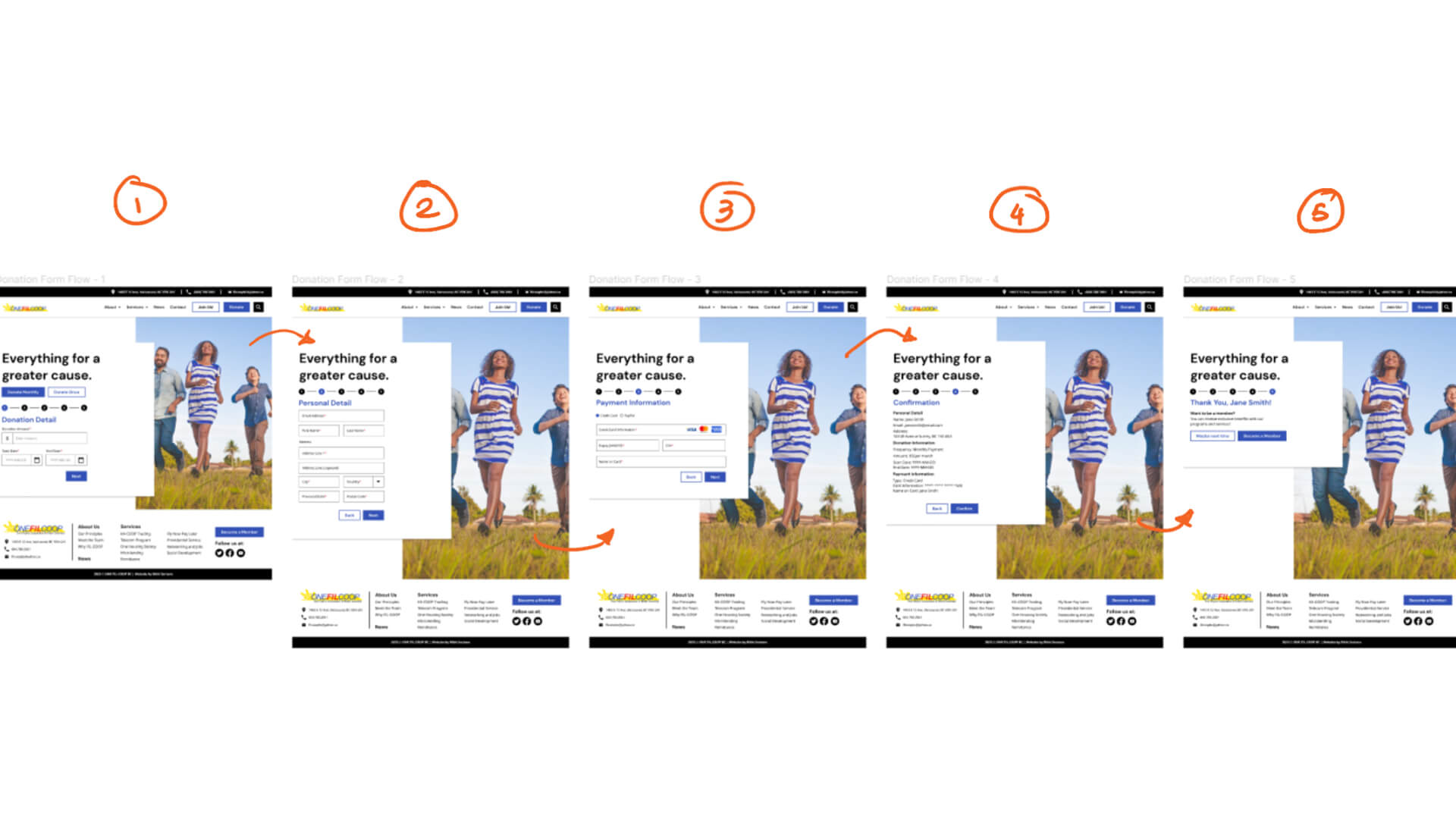
a vector image of an arrow
Images of FILCOOP's redesign screen displayed next to each other

FILCOOP BC | Website Redesign

  • UIUX
  • Figma

A website redesign to support modern web standards, better accesbility and user experience for the website users of FIL-COOP BC.

  • Timeline

    2 Weeks

  • Tools

    Figma

    Adobe Illustrator

The purpose: Give the website a re-design to modern standards and support the goals of the organization and the user.

Defining the Problem

Not only the aesthetics of FIL-COOP BC's website needs some touchup, but the information architecture of the website is unorganized and the main call to action of the website is drowned within pages.

an image of FILCOOP's old website

FILCOOP BC's current design of their News Bulletin page

Not only this is a frustrating experience for the user, but it strays away farther from reaching the goal of the organization.

One of the goals of the website is to get prospects to join them as members of the organization but as a user:

  • Why should I be a member?

  • Why should I donate?

  • Who do I reach for questions?

  • How do I sign up to be a member?

  • Where can I donate?

User Scenario

To have a great understanding of what is required of the website, I've created a user scenario with whom is a user that I can empathize.

a user scenarion for a persona names Christina Molina, with user scenarion description

A user scenario to define the problems encountered of a user.

In this scenario, we get into a role of a mother raising kids, who is looking to support her family by joining organizations that provide services and programs that FIL-COOP BC provides.

Solution

The redesign would support the user flow of being able to get the information they need and how they can donate to support the cause.

The possible solution:

  • Have a clear call-to-action button

  • Creating a user flow that directs them to donate

  • Restructure the information architecture for readability

Wireframes

Header/Footer

I started off by re-designing the header by reorganizing the information architecture of the website, stating the primary navigation and sub-navigations.

an image of FILCOOP's redesigned information architecture

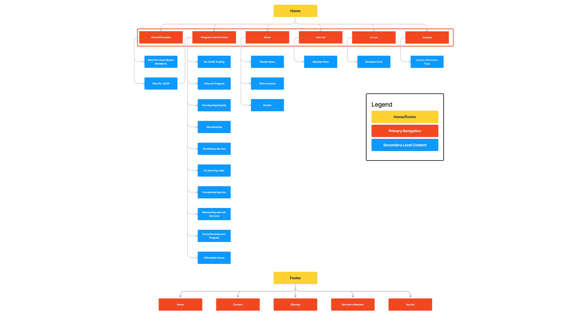
Restructured information architecture of the old website design.

The header is a crucial navigator for our user's journey, and by restructuring the information architecture of the website, we can make it easier for users to flow through their experience.

an image of the redesigned header of FILCOOP

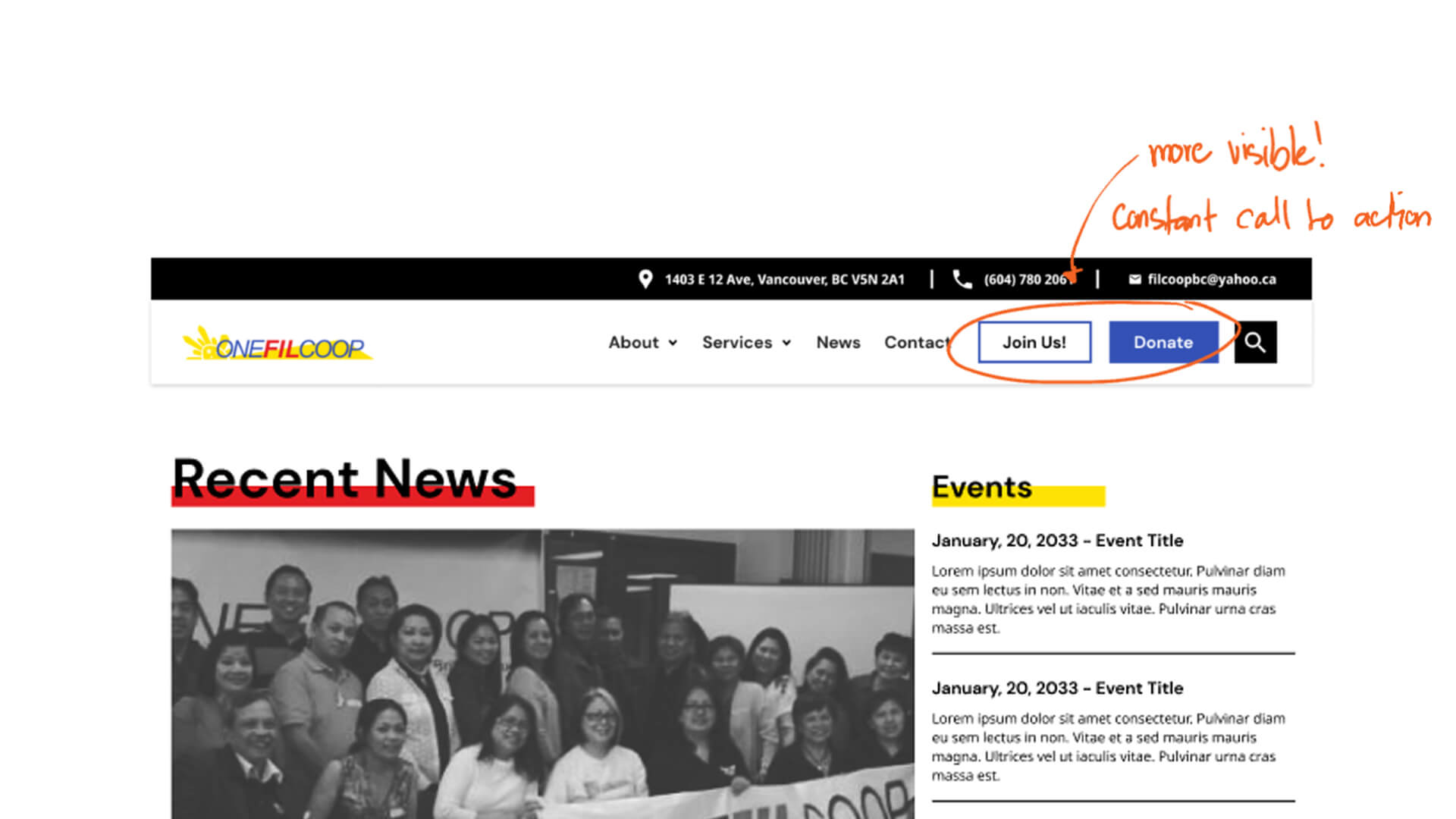
The redesigned header with a contrast call-to-action button.

A visible call to action also eases the process of being able to support the organization's goal so a user can decide when they want to donate while in the process of browsing.

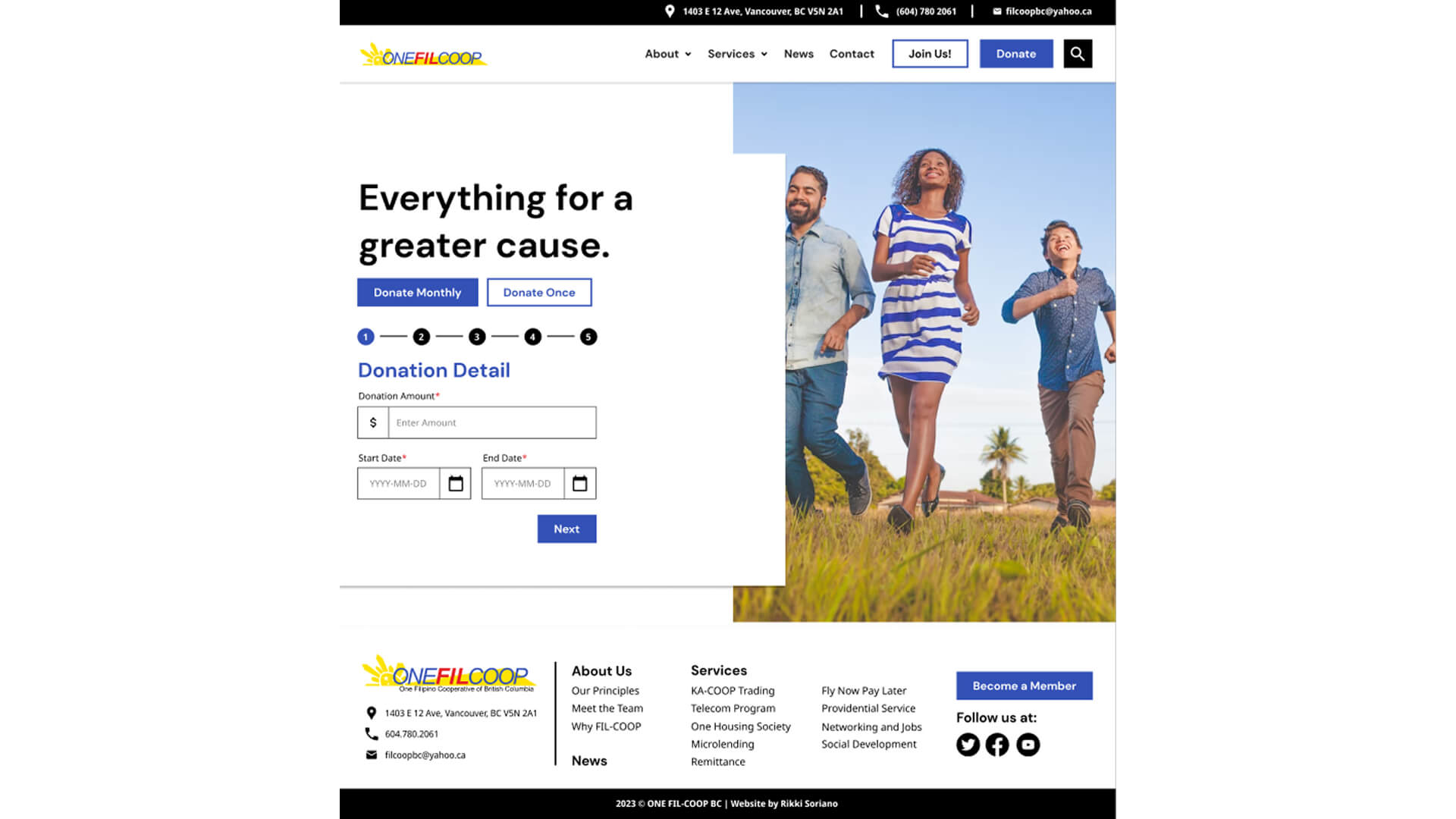
Page Sections/Typography Hierarchy

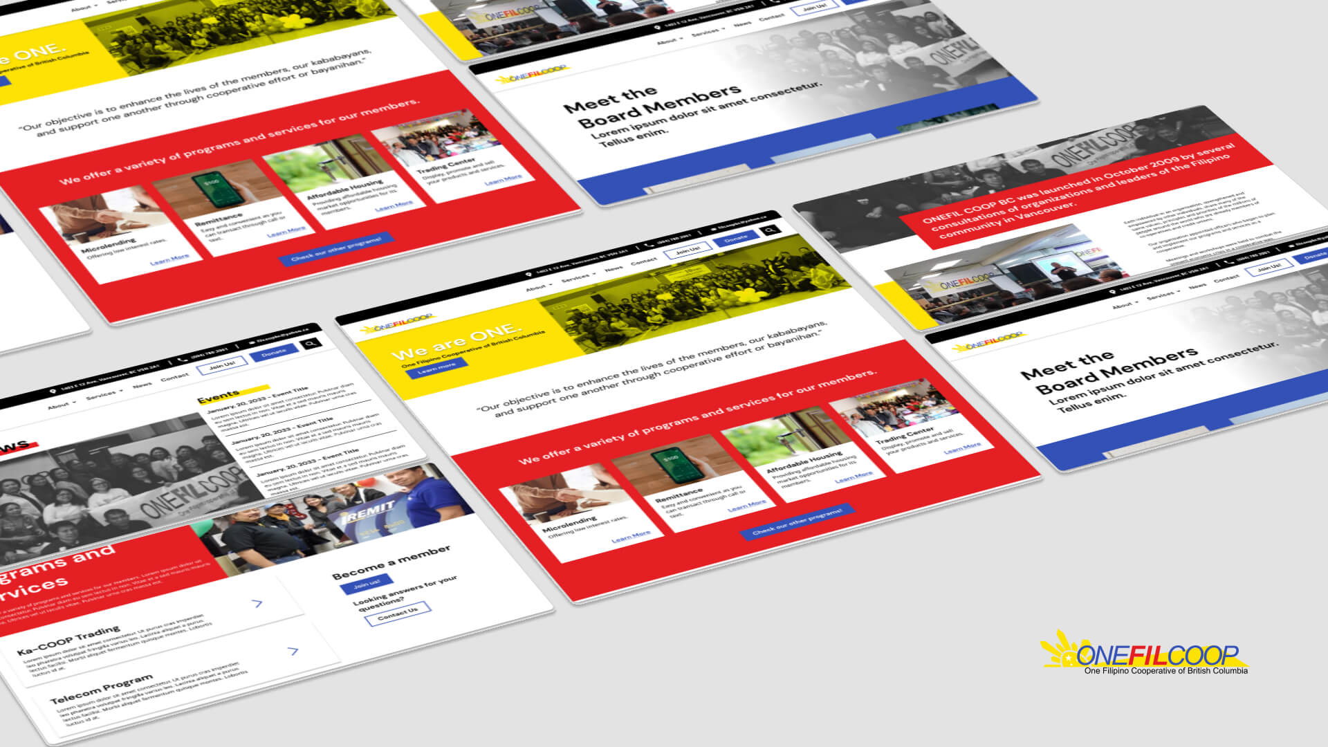
When creating the wireframes, I wanted a proper hierarchy of text since the website contains a lot of information in a text format. To achieve this, I've created proper and consistent sections to divide information and prevent cognitive overload.

an image of FILCOOP's homepage divided sections

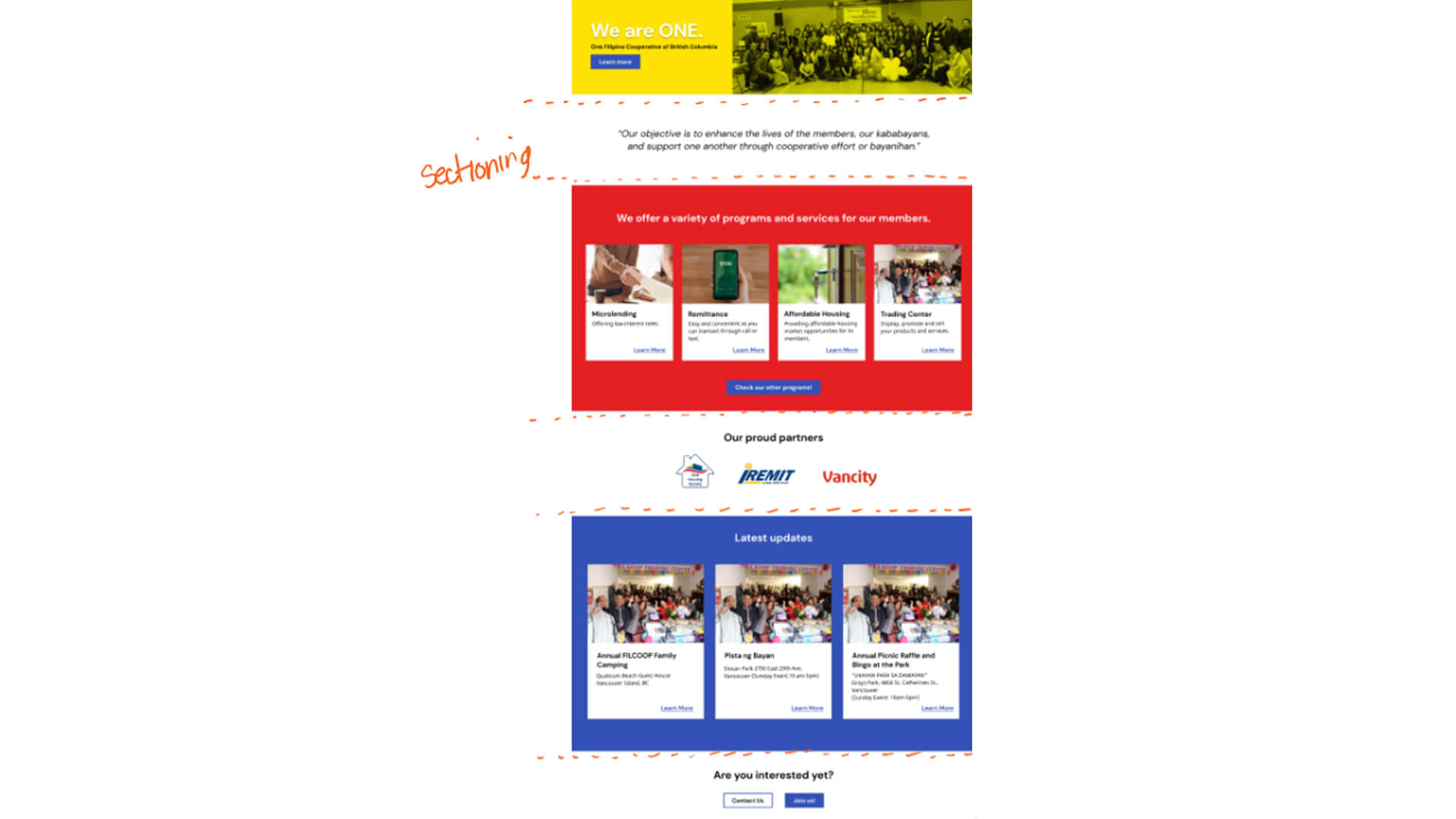
An illustration of divided sections on the redesigned websites homepage.

I've also added some image media that supports the text so the site feels livelier and supports the branding of the organization.

an image of FILCOOP's homepage divided contents

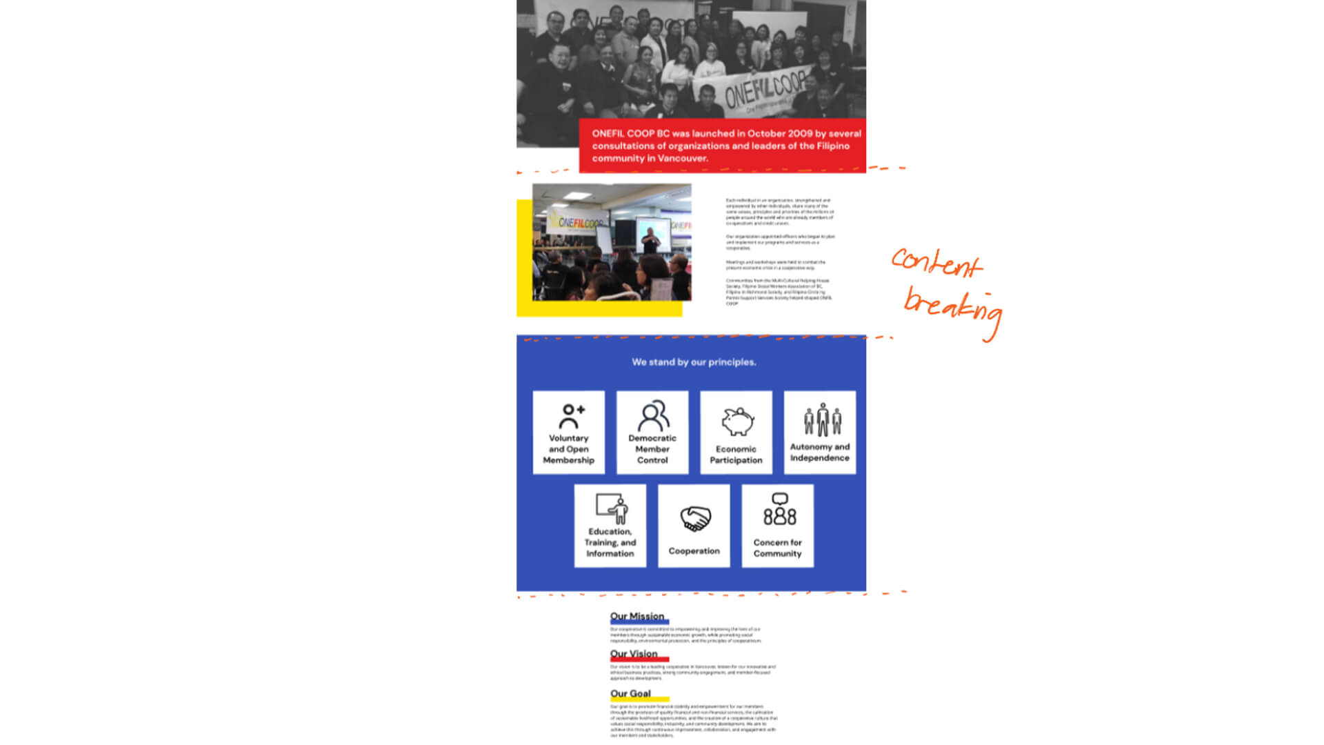
About page section content dividing

With consistent-sized headings and mixed media, we can engage and direct the user's attention easily so they have a better experience of reading and looking for the information they need.

User Donation Flow

To support the organization's goal of collecting donations, I've set up the header to have ease of access for the donate call to action.

an image of the redesigned information architecture

User donation flowchart

This then leads users to fill up a form with their information regarding donations.

first page of FILCOOP'S donation form

First page of the user donation form. Process is broken down step-by-step.

Since we're managing user information and payment, I've broken down the process into a step-by-step process to not overwhelm users as well as reduce input mistakes.

an illustration of how a user would donate

Donation step-by-step process

Project Reflection

Overall, this project is a great learning process for me in the importance of creating a design that supports both user and organizational goals.

Some key takeaway I would improve further is to keep in mind accessibility standards like the contrast of text. Having access to 3 branding colours give you the freedom to use them creatively, but at the same time must be used with intent.